On this page
使用函数绘制 matplotlib 的图表组成元素
绘制 matplotlib 图表组成元素的主要函数
在一个图形输出窗口中, 底层是一个 Figure 实例, 我们通常称之为画布, 包含一些可见和不可见的元素。
在画布上的图形就是 Axes 实例, Axes 实例几乎包含了我们要介绍的 matplotlib 的所有组成元素, 例如坐标轴、刻度、标签、线和标记等。 Axes 实例有 x 轴和 y轴属性, 可以用 Axes.xaxis 和 Axes.yaxis 来控制 x 轴 和 y 轴的相关组成元素, 例如刻度线、刻度标签、刻度线定位器和刻度标签格式器。
通过调用 matploblib.pyplot 模块的API中的函数, 我们可以快速绘制这些组成元素, 例如 matplotlib.pyplot.xlim() 和 matplotlib.pyplot.ylim() 控制 x 轴和 y 轴的数值显示范围。
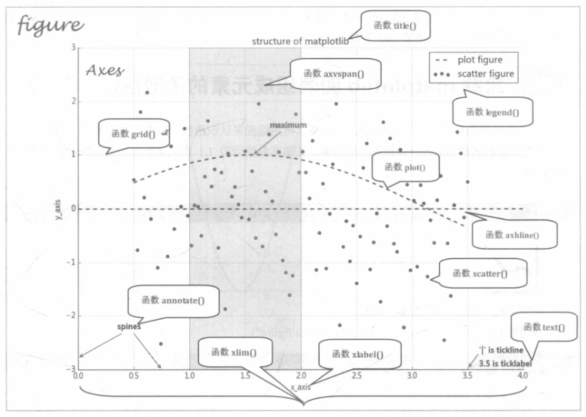
本章以上图为讲解切入点, 从这些函数的 函数功能、调用签名、参数说明和调用展示四个方面来全面阐述 API 函数的使用方法和技术细节。
绘制 matplotlib 图表组成元素的函数用法
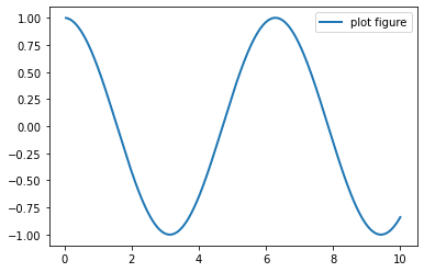
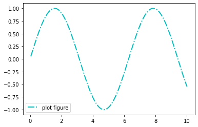
plot() —— 展现变量的趋势变化
plt.plot(x, y, ls=”-“, lw=2, label=”plot figure”)
展现变量的趋势变化
- ls: 折线图的线条风格
- lw:折线图的线条宽度
- label: 标记图形内容的标签
import matplotlib.pyplot as plt
import numpy as np

x = np.linspace(0.05, 10, 1000)
y = np.cos(x)

plt.plot(x, y,  ls="-", lw=2, label="plot figure")

plt.legend()

plt.show()
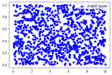
scatter()——寻找变量之间的关系
plt.scatter(x, y, c=”b”, label=”scatter figure”)
- c: 散点图中的标记的颜色
- label: 标记图形内容的标签文本
import matplotlib.pyplot as plt
import numpy as np

x = np.linspace(0.05, 10, 1000)
y = np.random.rand(1000)

plt.scatter(x, y, c="b", label="scatter figure")

plt.legend()

plt.show()
xlim()——设置 x 轴的数值显示范围
plt.xlim(xmin, xmax)
import matplotlib.pyplot as plt
import numpy as np

x = np.linspace(0.05, 10, 1000)
y = np.random.rand(1000)

plt.scatter(x, y, label="scatter figure")

plt.legend()

plt.xlim(0.05, 10)
plt.ylim(0, 1)

plt.show()
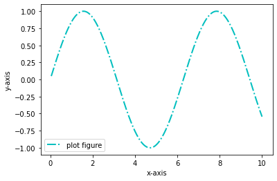
xlabel()——设置 x 轴的标签文本
plt.xlabel(string)
- string:标签文本内容
import matplotlib.pyplot as plt
import numpy as np

x = np.linspace(0.05, 10, 1000)
y = np.sin(x)

plt.plot(x, y, ls="-.", lw=2, c="c", label="plot figure")

plt.legend()

plt.xlabel("x-axis")
plt.ylabel("y-axis")

plt.show()
grid()——绘制刻度线的网格线
plt.grid(linestyle=”:”, color=”r”)
- linestyle: 网格线的线条风格
- color: 网格线的线条颜色
import matplotlib.pyplot as plt
import numpy as np

x = np.linspace(0.05, 10, 1000)
y = np.sin(x)

plt.plot(x, y, ls="-.", lw=2, c="c", label="plot figure")

plt.legend()

plt.grid(linestyle=":", color="r")

plt.show()
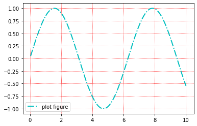
ls 就是 linestyle 的缩写, c 是 color 的缩写, lw 是 linewidth 的缩写。
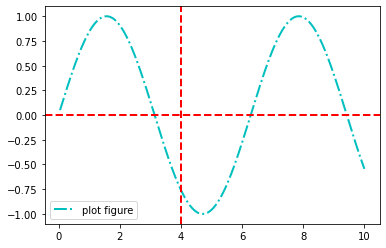
axhline()——绘制平行于 x 轴的水平参考线
plt.axhline(y=0.0, c=”r”, ls=”–”, lw=2)
import matplotlib.pyplot as plt
import numpy as np

x = np.linspace(0.05, 10, 1000)
y = np.sin(x)

plt.plot(x, y, ls="-.", lw=2, c="c", label="plot figure")

plt.legend()

plt.axhline(y=0.0, c="r", ls="--", lw=2)
plt.axvline(x=4.0, c="r", ls="--", lw=2)


plt.show()
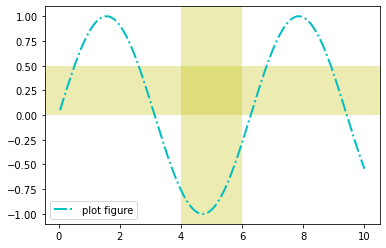
axvspan() —— 绘制垂直于 x 轴的参数区域
plt.axvspan(xmin=1.0, xmax=2.0, facecolor=”y”, alpha=0.3)
- facecolor: 参考区域的填充颜色
- alpha: 参考区域的填充颜色的透明度
import matplotlib.pyplot as plt
import numpy as np

x = np.linspace(0.05, 10, 1000)
y = np.sin(x)

plt.plot(x, y, ls="-.", lw=2, c="c", label="plot figure")

plt.legend()

plt.axvspan(xmin=4.0, xmax=6.0, facecolor="y", alpha=0.3)
plt.axhspan(ymin=0.0, ymax=0.5, facecolor="y", alpha=0.3)

plt.show()
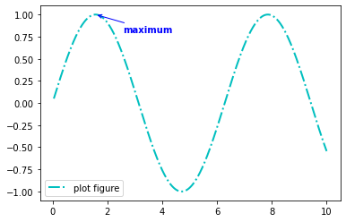
annotate() —— 添加图形内容细节的指向性注释文本
plt.annotate(string, xy=(np.pi/2, 1.0), xytext=((np.pi/2+0.15), 1.5), weight=”bold”, color=”b”, arrowprops=dict(arrowstyle=”->”, connectionstyle=”arc3”, color=”b”))
- string: 图形内容的注释文本
- xy: 被注释图形内容的位置坐标
- xytext: 注释文本的位置坐标
- weight: 注释文本的字体粗细风格
- color: 注释文本的字体颜色
- arrowprops: 指示被注释内容的箭头的属性字典
import matplotlib.pyplot as plt
import numpy as np

x = np.linspace(0.05, 10, 1000)
y = np.sin(x)

plt.plot(x, y, ls="-.", lw=2, c="c", label="plot figure")

plt.legend()

plt.annotate("maximum",
             xy=(np.pi/2, 1.0),
             xytext=((np.pi/2)+1.0, .8),
             weight="bold",
             color="b",
             arrowprops=dict(arrowstyle="->", connectionstyle="arc3", color="b")
            )

plt.show()
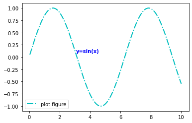
text()——添加图形内容细节的无指向型注释文本
plt.text(x, y, string, weight=”bold”, color=”b”)
- weight: 注释文本内容的粗细风格
- color: 注释文本内容的字体颜色
import matplotlib.pyplot as plt
import numpy as np

x = np.linspace(0.05, 10, 1000)
y = np.sin(x)

plt.plot(x, y, ls="-.", lw=2, c="c", label="plot figure")

plt.legend()

plt.text(3.10, 0.09, "y=sin(x)", weight="bold", color="b")

plt.show()
legend()—— 标识不同图形的文本标签图例
plt.legend(loc=”lower left”)
import matplotlib.pyplot as plt
import numpy as np

x = np.linspace(0.05, 10, 1000)
y = np.sin(x)

plt.plot(x, y, ls="-.", lw=2, c="c", label="plot figure")

plt.legend()

plt.legend(loc="lower left")

plt.show()
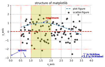
函数组合应用
import matplotlib.pyplot as plt
import numpy as np

from matplotlib import cm as cm

x = np.linspace(0.5, 3.5, 100)
y = np.sin(x)
y1 = np.random.randn(100)

plt.scatter(x, y1, c="0.25", label="scatter figure")

plt.plot(x, y, ls="--", lw=2, label="plot figure")

for spine in plt.gca().spines.keys():
    if spine == "top" or spine == "right":
        plt.gca().spines[spine].set_color("none")

plt.gca().xaxis.set_ticks_position("bottom")

plt.gca().yaxis.set_ticks_position("left")

plt.xlim(0.0, 4.0)
plt.ylim(-3.0, 3.0)

plt.ylabel("y_axis")
plt.xlabel("x_axis")

plt.grid(True, ls=":", color="r")

plt.axhline(y=0.0, c="r", ls="--", lw=2)

plt.axvspan(xmin=1.0, xmax=2.0, facecolor="y", alpha=.3)

plt.annotate("maximum", xy=(np.pi/2, 1.0), xytext=((np.pi/2) + 0.15, 1.5), weight="bold", color="r", arrowprops=dict(arrowstyle="->", connectionstyle="arc3", color="b"))

plt.annotate("spines", xy=(0.75, -3), xytext=(0.35, -2.25), weight="bold", color="b", arrowprops=dict(arrowstyle="->", connectionstyle="arc3", color="b"))

plt.annotate("", xy=(0, -2.78), xytext=(0.4, -2.32), arrowprops=dict(arrowstyle="->", connectionstyle="arc3", color="b"))

plt.annotate("", xy=(3.5, -2.98), xytext=(3.6, -2.70), arrowprops=dict(arrowstyle="->", connectionstyle="arc3", color="b"))

plt.text(3.6, -2.70, "'|' is tickline", weight="bold", color="b")
plt.text(3.6, -2.95, "3.5 is ticklabel", weight="bold", color="b")

plt.title("structure of matplotlib")

plt.legend()
test